Abamed

Designing an E-commerce shoe store for Tablet size screen

Abamed

Designing an E-commerce shoe store for Tablet size screen

Abamed

Designing an E-commerce shoe store for Tablet size screen

Summary

Abamed is a tablet app designed to simplify the sneaker shopping experience for men. My focus is to offer users a seamless interface where they can find everything they need without navigating multiple sections. Every use case is accessible from the initial screen, a result of our extensive app redesign efforts. I dedicated considerable effort to comprehensively redesign the application, aligning its functionality with this vision.

My Role

UX Design

UI Design

Prototyping

WireFraming

Interaction Design

The problem statment

The Aba Med app serves as a platform dedicated to the purchase of high-quality designer footwear for men. This application boasts a user-friendly interface, ensuring effortless navigation and a straightforward shopping experience.

Here is the problem

Usability Challenge: Users find the current interface difficult to navigate efficiently, leading to frustration and reduced engagement

Cart Management Complexity: Users find the current interface difficult to navigate efficiently, leading to frustration and reduced engagement.

Transaction and Payment Inefficiency: Users express a desire for a simplified and streamlined payment process, currently dissatisfied with the complexity involved in completing their purchases.

Here is the new solution

To simplify user navigation, content addition, shopping, and payment processing within the app, the following design enhancements were implemented :

The Aba Med app serves as a platform dedicated to the purchase of high-quality designer footwear for men. This application boasts a user-friendly interface, ensuring effortless navigation and a straightforward shopping experience.

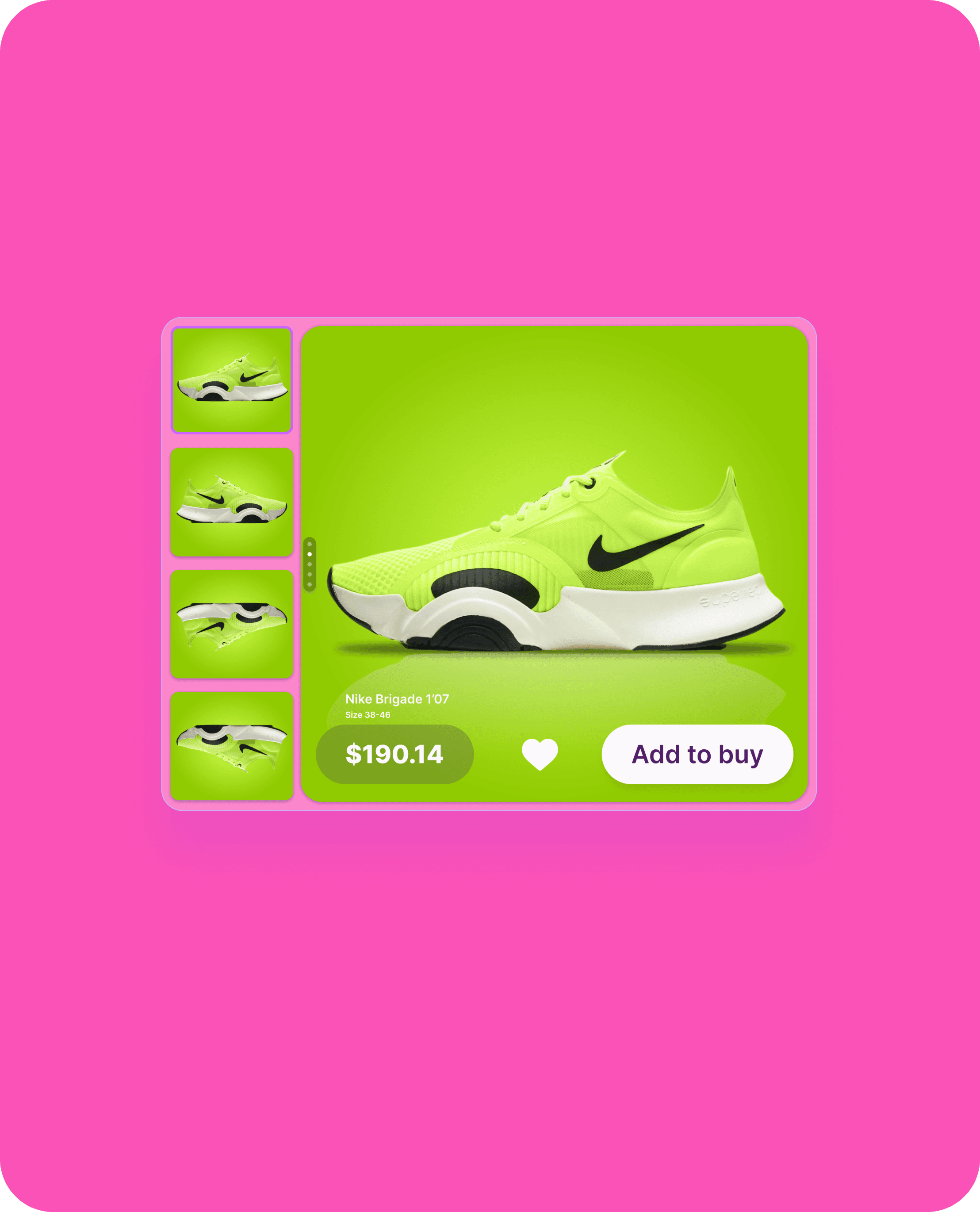
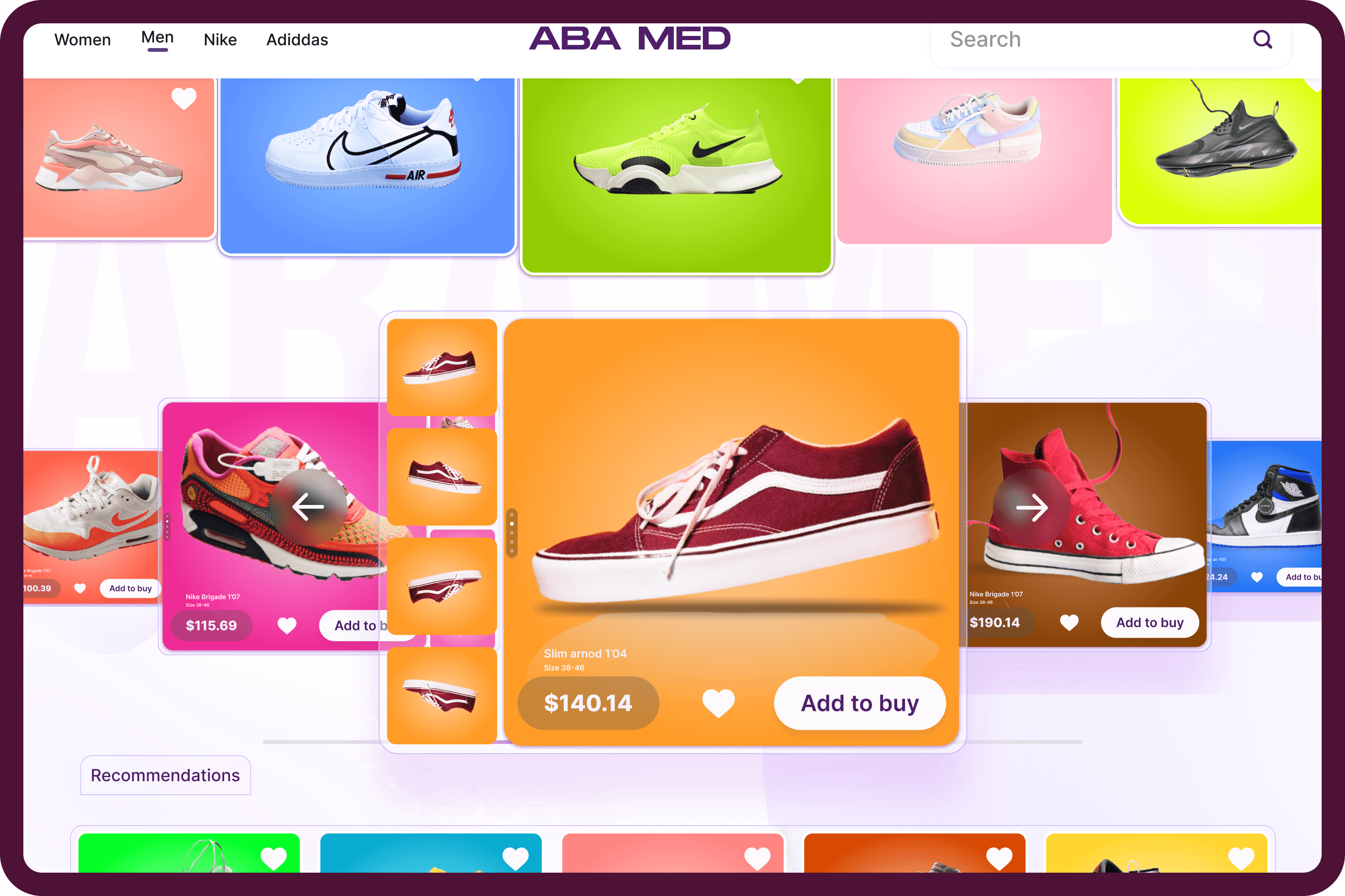
I streamlined item selection and cart management to a single click. With this intuitive design, you instantly create a profile and add items to your cart, all displayed on your screen. Simplifying item selection has never been this easy, thanks to this innovative approach.

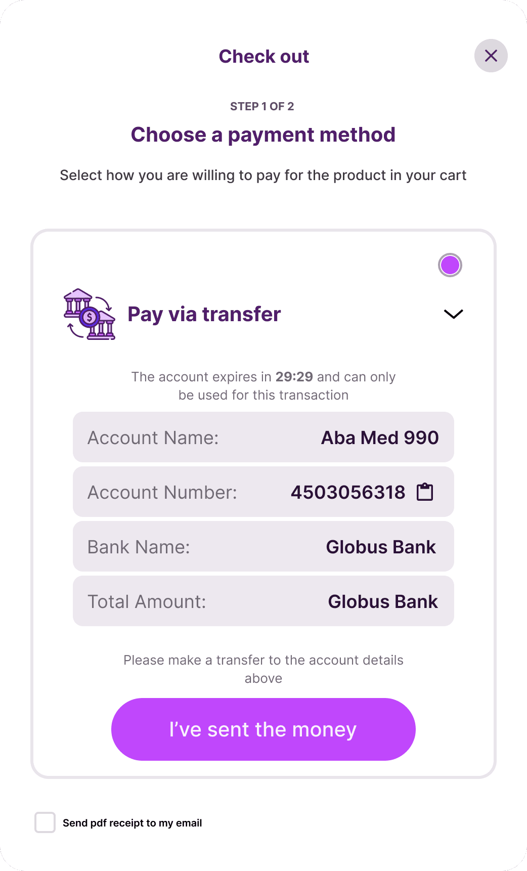
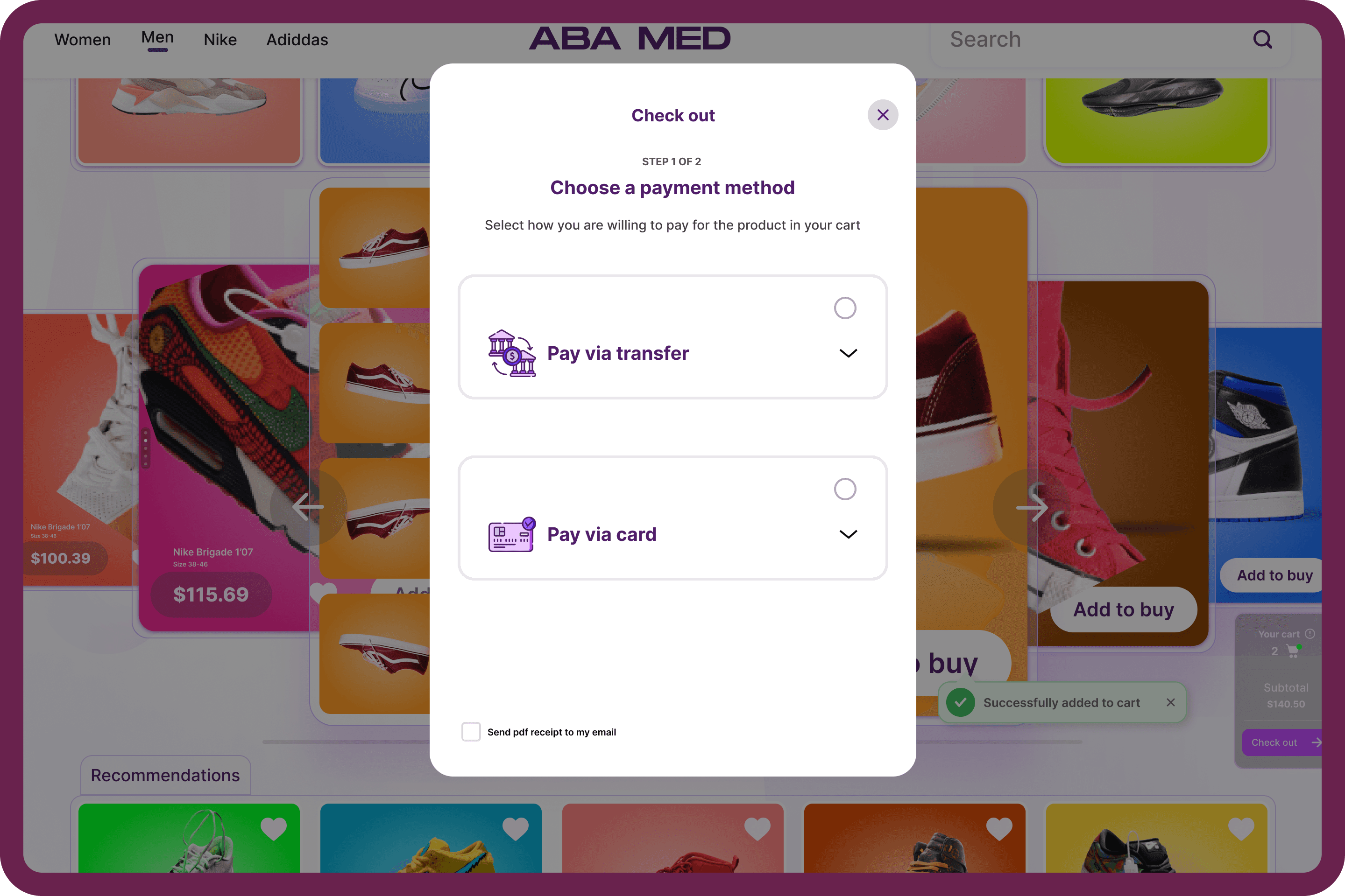
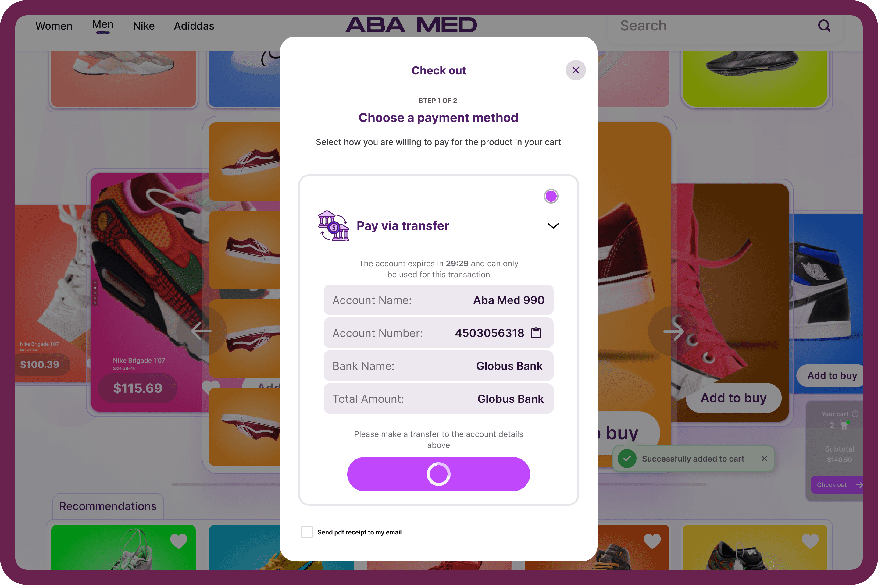
I also revolutionized the transaction system, simplifying it into just three effortless steps:

Click, Add Card, and Confirm Payment.

This streamlined process ensures a seamless and user-friendly experience, allowing customers to pay for their products with unparalleled ease. Embrace the newfound simplicity in product payments.

This is my process to creating this solutions

This is my process to creating this solutions

I proactively discussed my design goals with the project supervisor and received a preliminary design sketch.

I then conducted a detailed analysis of the application's functionality, particularly the user journey related to purchasing.

I promptly began sketching design concepts for each section, resulting in a cohesive final design structure and an improved user flow

I swiftly selected a specific segment from the user flow structure and conducted a meticulous analysis.

This led to the creation of a preliminary visual representation, with particular attention directed towards refining the 'Add to Cart' section and optimizing the display name. The visual refinement process involved multiple iterations to establish the final structure. It's worth noting that this phase marked the 'Discovery Stage,' distinct from the design phase.

I meticulously charted the app's final user flow, with particular emphasis on enhancing the payment process

Armed with a comprehensive low-fidelity blueprint of the anticipated final design, I embarked on a curated exploration of notable design inspiration platforms. This allowed me to collate images that aptly encapsulated my envisioned design ethos. Subsequently, I crafted the app's initial design and promptly submitted it for peer review, leading us to a refined version of our final design.

I refined the app's scrolling mechanism for optimal usability and then outlined the user journey for adding products to the cart.

Drawing from online inspirations, I crafted a distinct design style. After consolidating the designs, I sought feedback. The final challenge was the checkout process; it was essential to ensure its seamless integration on a single page while maintaining user-friendliness.

Every detail in the visual was intentionally crafted

The following screenshots provide an in-depth examination of the design, underscoring my unwavering commitment to meticulous attention to detail in every project. As a product designer, I am dedicated to ensuring that no aspect of the design process is overlooked.

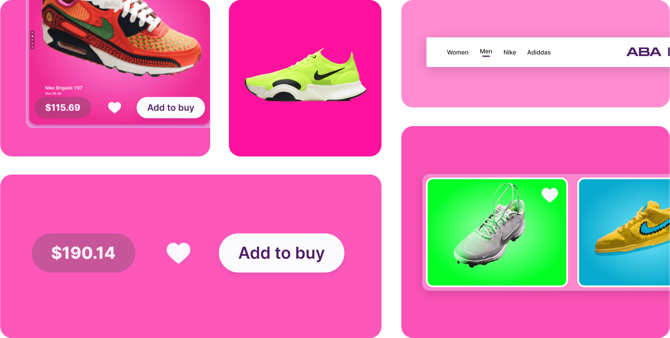
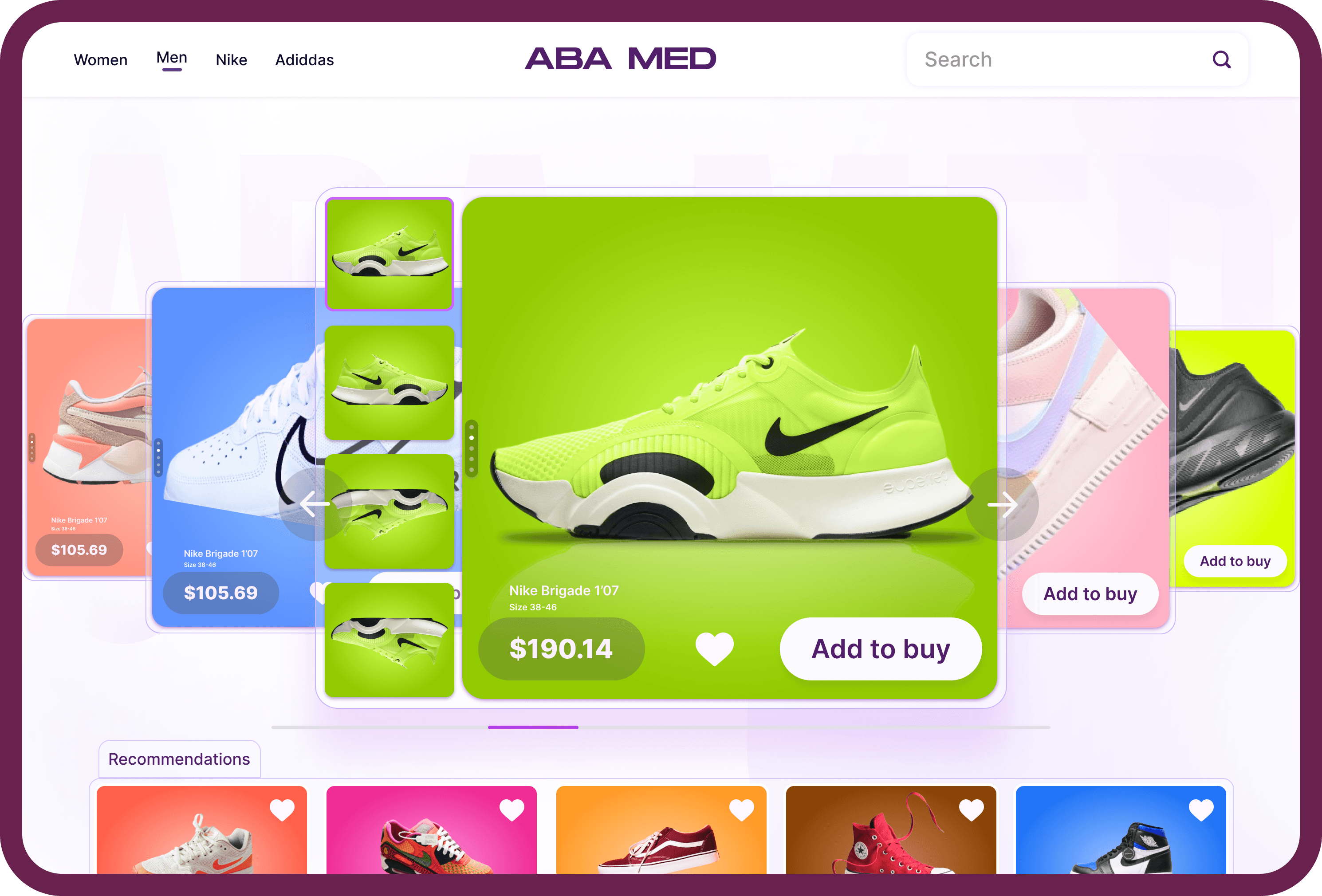
Strategic Aesthetic Integration and Attention-Grabbing Design

The designs exhibit exceptional clarity and cleanliness while seamlessly integrating functionality with a captivating aesthetic appeal. Notably, they are poised to consistently capture the attention of viewers from a considerable distance. The deliberate use of vibrant colors has been strategically employed to enhance visibility and create a distinct visual impact, ensuring that the design effortlessly stands out

Live prototype

This is the prototype i did in figma. Here you can interact with the final design or request access to the figma and figjam file

Conclusion

The Future Enhancements for this Tablet-Based App Interface With the interface been redesigned, I anticipate several advancements in the near future, this would be the progress:

Cost Efficiency:

The streamlined nature of the app, characterized by fewer pages and consolidated sections, will likely lead to reduced development costs in subsequent iterations.

Optimized User Experience:

The streamlined nature of the app, characterized by fewer pages and consolidated sections, will likely lead to reduced development costs in subsequent iterations.

Payment Process Refinement:

The streamlined nature of the app, characterized by fewer pages and consolidated sections, will likely lead to reduced development costs in subsequent iterations.